Breathing New Life into a Strong Brand
By Egotist / /
Fresh off the press from our friends at Kick:
Sometimes a brand is strong but needs a simple refresh to the logomark and an expansion of the visual identity branding system surrounding it.
This is why O2 Concepts, a pioneer and innovator of portable oxygen concentrators (POCs) that truly make patients’ lives better, came to Kick. O2 Concepts was about to launch a transformative new product and wanted to make sure the corporate brand looked the part of an innovator.
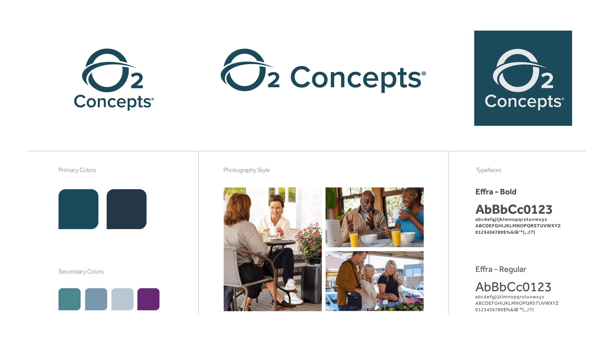
O2 CONCEPTS REFRESH First, we refined the brand positioning and put trust and reliability at the core of it as O2 Concepts is more reliable, durable and long-lasting than others in the market — key for helping people enjoy the small things in life like being able to go to the grocery vs being chained to a bulky oxygen tank at home.
With this in mind, we designed the brand refresh to be approachable, clean and straightforward. It highlights the innovation of O2 Concepts while staying grounded and reliable.
Palette
The monochromatic blue palette is a nod to O2 Concepts’ knowledge, authority and reliability, while the muted tonality gives it an approachable, honest and hard-working feeling. The injection of a purple for DMEs gives a sense of energy, passion and new life in the oxygen-delivery market.
Imagery
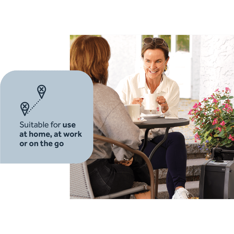
Photos showcase real people enjoying normal activities in their everyday lives to highlight the mobility a POC from O2 Concepts delivers. Kick shot photos in relaxed environments, with individuals enjoying small moments with family and friends — the moments that give life texture. The varied scenarios showcase the reliability and long-lasting battery life of the devices while the lifestyle cues highlight everyday usage.
Iconography
Designed to be simple and subtle, the iconography utilizes rounded corners for softness and solid, thick divider lines for authority.
Brand Tone
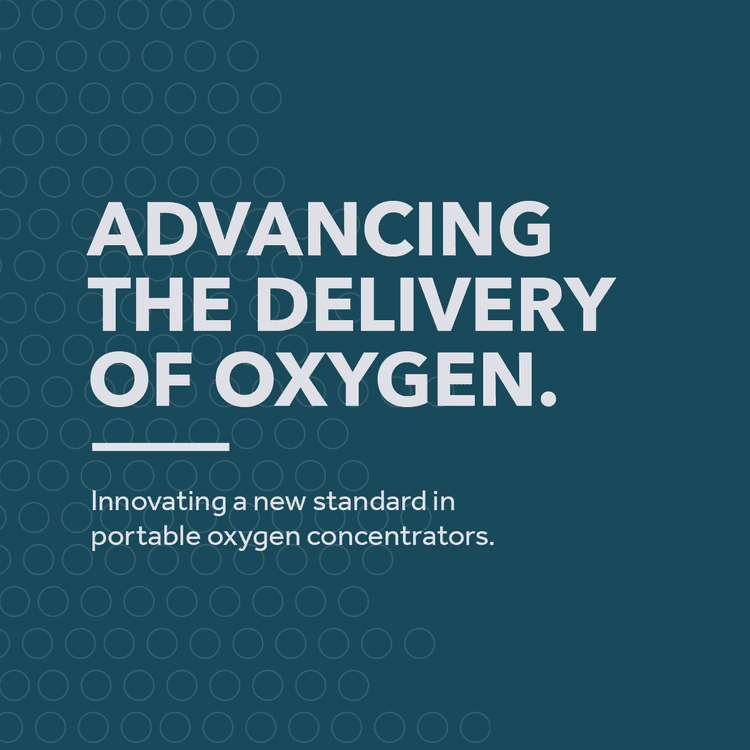
As the innovation leader in the category, O2 Concepts speaks with an authoritative yet practical tone and manner. Clean and straightforward, short paragraphs flow through the communication elements creating hierarchies in the messaging, from strong headlines to detailed bullet points. Launched at MedTrade in October, the new identity system and tools are invigorating the sales team as well as creating a stir in the market for the newly launched OxLife Liberty™ POC.
“Our new design is phenomenal,” says O2 Concepts CEO, Elby Beal. “We stand out from the competition and look fantastic. The details in the design and messaging allow me to show up as the best in the market.”

Looking to breathe some life into your branding? Reach out to us at Kick to help you show up as the best in the market.

Comments