
“Just Sayin’…” by Doug deGrood
By The Minneapolis Egotist / /
Observations from a mostly retired but still fully functioning advertising mind
By Doug deGrood
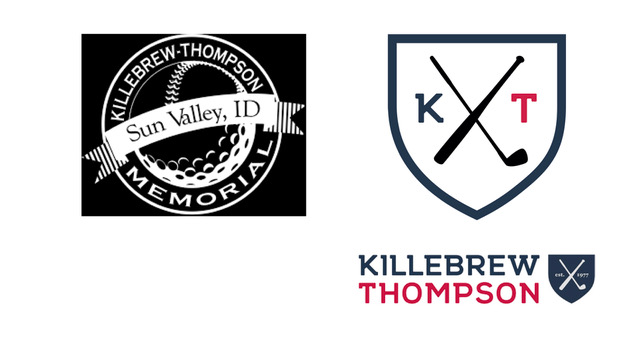
About a year ago on LinkedIn, I shared a logo redesign my daughter Gigi and I did for the Killebrew-Thomson Memorial, a word-class golf fundraiser in Sun Valley, ID (and now Minneapolis) that has raised millions of dollars for leukemia and cancer research since 1977.
Back in winter of 2022, Hannah Stauts, their executive director, happened to be in town and wanted to discuss Doogie McShank’s getting involved as a sponsor of the Minneapolis golf event. Over lunch, I opened my big fat mouth and asked about their logo. I told her if you’re going to invest money embroidering it on shirts and hats and you want participants to wear them long after the tournament, it needs to have a certain aspirational look. That was my polite way of saying, “Your current logo isn’t very cool.” It was too busy, didn’t embroider well and appeared a bit dated. The organization’s slogan is, “Taking a swing at cancer since 1977,” and frankly, that would have been my guess as to when the logo was designed.
Hannah totally agreed. And right then and there, over bites of arugula salad, we hashed out a plan for me to go back to my office and provide some thoughts on a logo redesign, much of what ultimately was based on stuff we had scribbled on napkins at the restaurant. Within a few days of that fateful lunch, the following logo was shared via email and approved on the spot. (I’ve included their previous logo for reference.)
Now, I’m not putting this forth as God’s gift to logos, but when you compare it to where Killebrew Thompson Memorial was, it’s an upper-deck home run. It’s cleaner, simpler, classier. The crossed bat/golf club pays homage to Harmon and Danny and instantly communicates their credo, “Taking a swing at cancer,” but in a much simpler, tastier way than the previous design. The shield icon comes right out of the world of golf, appropriately, and makes for a terrific stand-alone icon, tailor made for apparel embroidery. The color scheme even pays homage to Messrs. Killebrew and Thompson’s team, the Minnesota Twins.
And all of this came about without a single meeting or creative dog and pony show. Just an idea hatched over lunch, a little ‘roll-up-the-sleeves’ time, a few emails exchanged, and voila.
Anyone who has experience with this stuff knows that the process normally takes months and months of input sessions, strategy work, a meeting to approve the strategy, creative work, internal meetings to approve the creative, a formal client presentation, a follow-up meeting to provide feedback, discuss tweaks, several rounds of revisions and finally, hopefully an approved design. Total cost?: several months and $150K (on the low end).
None of this is to suggest that clients and agencies should forego strategy, input and the like. But it is to say, it’s amazing what you can accomplish when you rely more on intuition than process; when you think, but resist the temptation to overthink; when you hire people who know what they’re doing and then trust them do it. Sadly, this is becoming rarer and rarer in today’s world of teams and collaboration. Some of that stuff is certainly welcome and valuable. But too much of it is not only needless, it’s wasteful and leads to creations like the Pontiac Aztec.
As my old pal, Cabell Harris at WORK labs (Richmond, VA) used to say, “It ain’t rocket surgery, Doug.”
Just sayin’…


Comments
Mike Swanson July 22, 2024
You are the sharpest knife on the tree, Doug.